INTRODUCING THE STEPS OF COMIC CREATION
Duration: 60 minutes Objectives: At the end of this lesson, you should be able to plan the creation of your own comics without forgetting anything nor getting lost in the process. Desirable outcomes and competences: By the end of the lesson, learners should be able to:
|
Now that you know more about comics theory, the possible contribution of comics to your classroom, and that you are more familiar with using comics to aim towards specific learning objectives, it is time to start creating!
If you do not picture yourself as a creative person, starting to create comics might look complicated. Therefore, the third part of this e-learning course, entitled “Creating Comics”, will help you plan the creation process, design your comics, and explore different tools and techniques. In this lesson, we will introduce the main steps to create comics as a teacher. We have organised these steps into two stages: pre-conception and conception.
Preconception: how to imagine your own comics
Realise that you are creative
First, we would ask you to take a short time to think about activities during which you get creative. As a teacher you are likely to be exercising your creativity almost every day. This step is important for you to realise that you have creative potential in order to start building your creative confidence to design comics.
A quick read of this article by Constantinides (2015) could inspire you: it presents 8 ways for teachers to get more creative at work. You will probably realise that you are already using some of these strategies, which means that you are more creative than you might think!
List your ideas
Chances are that by the time you reach this lesson, you will have thought about several scenarios for comics, or points of lessons that you think comics would make easier to understand by your students. The first step you must take is to write them down. Your ideas might not look logical, and they can look somewhere between detailed scenarios to simple elements of story. If you just think about learning objectives you would like to tackle, write them down too. At this stage, the point is to make as big a list as possible.
Get additional inspiration
In the previous step, you might have listed a few ideas or many. Or maybe, you had none. This is what this paragraph deals with: how to get inspired when you seem to have no idea as to what you want to talk about in your comic.
There are several ways to do this:
- First, you can gather comics that you like, focusing on shorter forms of comics or on specific scenes in comic books or graphic novels that you particularly like.
- Then, you can start improvising simple plots by taking elements from what is around you. Let us say that you have a cup of tea in the room you are in, and you wanted to create comics about idioms to use in your lessons. What story could you create about this cup of tea? Write 3 to 5 ideas, however silly they might sound at first.
- Another way to integrate elements from your surroundings into a story is to use one of the comics you like and to replace a character or an object with something that is around you. How would that change the situation? Could this create an interesting story?
- If you are a seasoned writer, you could even look for writing prompts on specific themes.
Developing the plot, writing the script and storyboarding
After all these steps, you should have brainstormed a rich list of ideas or elements to create your stories. Now might come the most difficult part, which is to choose one idea to start with.
If you do not manage to pick one idea from the list, try and sort the ideas you had by category. It might help you see more clearly through your notes 
Once you have chosen one idea, you can write your story. You can start by writing the story in one or in a few sentences. Then, at this stage, you can either write down your script, or start to scribble down your ideas into panels or into a draft storyboard directly. The idea of these steps is to make sure you know what to show and how. These steps will be detailed in lessons 11 to 14, so for now it is ok for you to try these steps without too much theory.
Conception: the steps to create your comics
Now you have your story, it is time to transform it into sequential art!
Let us start with some theory:
As we have seen in Lesson 4, comics are a form of sequential art as they depict a sequence of moments to make a story. Therefore, you need to choose the moments of the sequence you wish to depict and how. McCloud (2006) proposes to define your choices in the following order:
- First, choose the moments you wish to include in your story, and those that you choose to leave out;
- Then, choose how to frame these moments: will you show things from far away or from up close? More details about framing and storyboarding will be explored in lesson 14;
- Next comes the choice of image: “rendering the characters, objects and environments in those frames clearly”;
- Followed by choosing the words you wish to include to add information to the images, which can be in speech bubbles, narration boxes, onomatopoeias, etc.;
- Finally, you need to choose the flow of your comic, in other words, the way you guide the reader from panel to panel.
And now for more practical guidelines:
The reason why we do not dive into too much theory nor details about the 5 choices is first, so as not to hinder your creativity, and second, not to intimidate you with notions that might seem complicated for now. Therefore, we gathered in the text and presentation below the main aspects you should pay attention to when creating your first comics. Based on these, you will go through the next lessons with a basic toolbox, and once you get used to creating short comics, you will be able to review your own creations in lessons 16 to 18.
Storyboarding
Congratulations, you now have a draft of what you would like to include in your comic! In order to create your comic, you have to create a storyboard. In the case of comics, a storyboard can be seen as a draft comics that allows you to arrange the panels on the page and to arrange the elements in each panel (characters, bubbles, text, etc.).
Here are the aspects to think about to turn your ideas into a comic.
Choose your page layout
Storyboarding can be confusing at first. If you try to create panels as you draft your comic, you might end up realising you do not have enough space to finish your story. If you use an existing template, it might be difficult for you to have the proper moments of the action in the appropriate panels.
Therefore, here are a few rules to remember that can help you make sense of which type of page layout is best for your use.
Think about the way you will share it with your students
A strip that looks good on screen, where you can resize as you want, might not look as good on paper. Similarly, you will not be able to include as many details or panels if you print in A5 or A4 format.
For example, when the strip below is printed on A4 paper in portrait format, text must be big enough to be read easily.
A versatile format for beginners could be the Japanese vertical 4 panel comic strip, as it provides sufficient space for illustrations and for horizontal text.
Browse page layouts on comics creation tools
Comics creation tools come with the most common forms of page layouts as well as more creative ones.
In general, the more regular your layout is, the less it can be used to convey a sense of speed and action. Also, as a rule of thumb, the bigger the panel, the longer the reader will look at it.
Plan your pages with speech bubbles and text included:
- The order of the bubbles is determined by the order in which you read, so you should make sure they do not hide important parts of the image. It will allow you to make sure that you have enough space for your bubbles, as well as your text.
N.B.:
|
Bubble placement
There will be a video about bubble placement and order at the end of lesson 16. As there is already a lot for you to learn and explore, we thought it best to keep these details for later. In the meantime, here are some principles to bear in mind:
- The tail of a bubble should be placed at the centre of a bubble as much a possible;

- The tail of a bubble should point to a character’s mouth: hence the importance of planning your storyboard with bubbles included;
- When characters speak a lot of text or give a lot of information, use double bubbles;
- The tails of bubbles should not cross one another. It could create an intentional impression of confusion in the dialogue, but it risks end up looking messy and make it harder for students with SLDs to read.
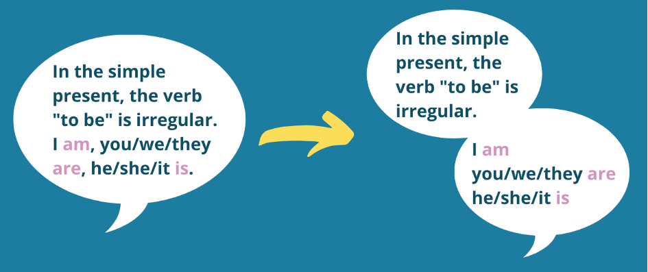
IDEATION, SOURCES OF INSPIRATION AND STORYTELLING PRINCIPLES
|
Duration: 60 minutes Objectives: The objective of this lesson is to have a better understanding of how to create your own comic and to find sources of inspiration. Desirable outcomes and competences: By the end of this lesson the learners will be able to write a plot and a script; they will understand the format of a comic and they will be able to use different storytelling techniques.
|
How to get started
A comic strip is usually composed by a series of elements which together tell a story. These are: panels, gutter, tier, splash, spread, caption, speech bubbles. Alongside these elements, you also have to understand the different storytelling techniques you can use and the design of your comic strip.
Panel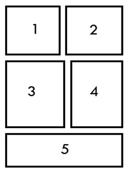 |
A panel is an individual frame, or single drawing on a page. A comic book consists of one or more panels which tell a story with figures and speech bubbles. |
|
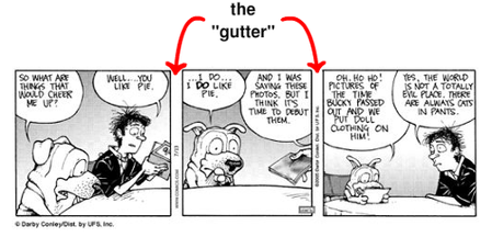
Gutter
|
The space between the panels. |
|
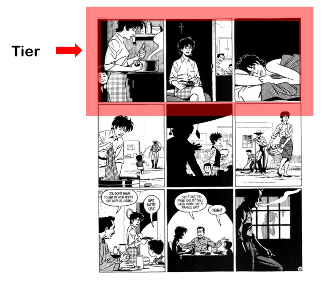
Tier
|
A single row of panels. |
|
Splash
|
A page – usually at the beginning of a comic book, but not always – used to introduce the story and to get the reader’s attention. It usually consists of illustration that takes most of the page, often with the title of the book or volume. |
|
Spread
|
An illustration that is extended on more than one page. |
|
Caption
|
A box that contains a text which provides context for the events. |
|
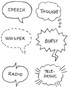
Speech bubble
|
The speech bubbles contain the dialogue of the characters. |
In this part of the lesson we will be elaborating on what has been briefly mentioned in Lesson 10.
The writing process can be intimidating for both teachers and students. How do you get started? Sometimes it is difficult to put down on paper what you have created in your head. So, let’s take it step by step.
Firstly, imagine your characters and write some bullet points which include important information such as physical description, emotional state, social status, current work situation, relationships and so on. Then, write an outline which will help organise your thoughts. Write a list of all your ideas in a chronological order, checking the logical flow of the story. This will give you a better understanding of how much you need to write on each page and how long your comic will be.
Next, develop those ideas even more and start writing the plot. Now you can add the dialogue and revise everything, make any necessary changes and add key elements that you need to have in each panel such as the caption, the angle, the position of the characters, their facial expression. Write the dialogue separated from the caption as it makes it clearer to read. Keep in mind that the dialogue has to be as realistic as possible, so it’s recommended to put yourself in the shoes of your characters and write differently for each of them based on their mood. To make sure the dialogue sounds realistic you could read it out loud and remember that you can always change it later. Every detail is important because it will help you visualise your comic and when you or your students start designing it will be easier for them to follow the story.
Example
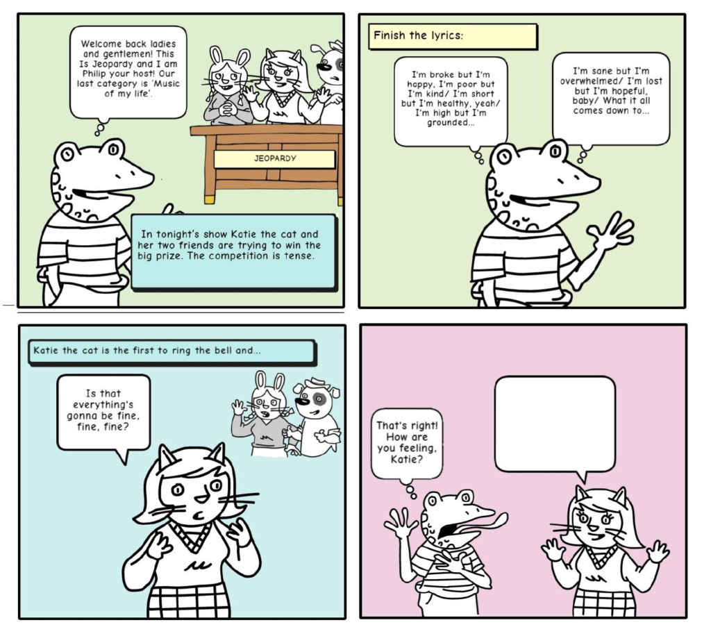
Page One
Panel 1: Wide shot of Philip the Frog speaking into the microphone while in the background we can see Katie the cat and the other 2 contestants. They are eager to start the show. Philip is framed slightly off-centre.
- Caption says: Philip the frog is the presenter of the classic game show ‘Jeopardy’. In tonight’s show Katie the cat and her two friends are trying to win the big prize. The competition is tense.
- Philip: Welcome back ladies and gentlemen! This Is Jeopardy and I am Philip your host! Our last category is ‘Music of my life’.
Panel 2: Caption says: Finish the lyrics. Close up of Philip who is now in the centre of the panel and the spotlight is on him.
- Philip: “I’m broke but I’m happy, I’m poor but I’m kind I’m short but I’m healthy, yeah I’m high but I’m grounded, I’m sane but I’m overwhelmed I’m lost but I’m hopeful, baby. What it all comes down to…”
Panel 3: Katie comes in front of the other contestants and stays next to Philip. The caption says: Katie the cat is the first to ring the bell and gets a chance to answer.
- Katie: Is that everything’s gonna be fine, fine, fine?
Panel 4: Close up on Philip. He is on the left side on the panel. Katie is now back next to the other contestants.
- Philip: That’s right!! Congratulations!How are you feeling, Katie?
Panel 5: Wide shot of everyone. Katie looks excited. Her speech bubble is blank.
Elements of a plot:
We could structure any plot in three parts: the beginning, middle and end.
- The beginning introduces the hero, the villain and the background story, as well as the story’s dramatic question which grabs the reader’s interest.
- The middle shows the hero’s journey. Make sure you create a series of obstacles that the hero will overcome dramatically.
- The end answers the dramatic question – for example: Will Jim win the race? – and shows the protagonist doing so.
Writing Exercise
Write down five events, five characters and five classic stories (fairy tales, myths, family stories). Next, choose one item from each list and start writing your short story.
Storytelling techniques
Comics or graphic novels are said to be one of the few art forms in which words and images are merged to tell a story. We use different storytelling techniques to guide the reader through the imaginary space in which the story unfolds. Below you can find a series of useful techniques that you might use in your comic creation process.
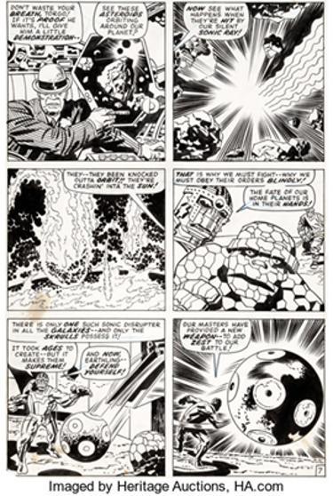
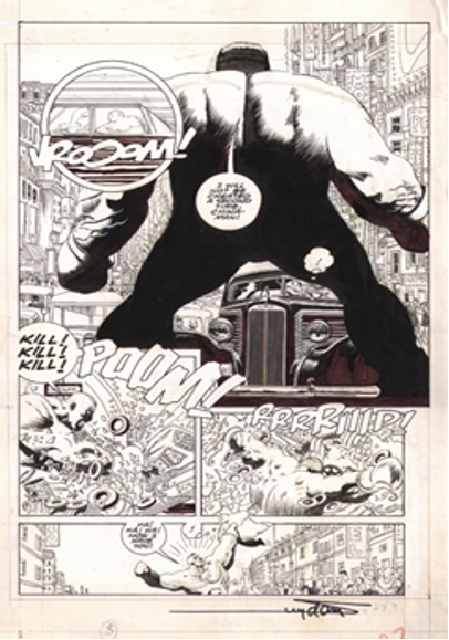
The compressed style of storytelling is characterised by the short and controlled way that comic books can tell a story. It includes big iconic images and bridge-over text, which combined tell the story while delivering impact. It can be used to introduce a new character and show them in action or to convey a quick-paces scene. Usually, the storytelling is fast-paced and each panel contains a new piece of action without focusing on analysing each moment. Later, decompression was introduced to comics and it looked at the action more in depth. Modern comics tend to use both techniques in the same story.
This page from Fantastic Four #93 by Stan Lee uses compressed storytelling and is a good example of how a scene can be moved forward by both dialogue and image in only six panels. (Greenfield 2018). The scene could have been going on for hours or days, but it is presented in one image.
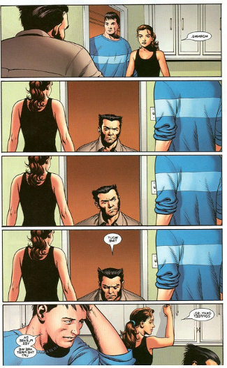
Decompression is a stylistic storytelling technique rich in character development and mood, with emphasis on visuals and slower-moving plots. This style was first introduced by manga writers where one moment could be stretched out for pages, but it quickly became popular in different parts of the world and it was adopted by many comic creators. Decompression is needed for significant character moments such as emotional conversations or suspense situations that need to be dramatized.
A good example of decompression is a scene from The X-Men #14 (Wikimedia.org, 2020) , in which Wolverine (center) takes a whole page to congratulate Kitty Pryde and Colossus for advancing their relationship.
“Show, Don’t Tell” is a technique often used in comics where the visuals carry the story points and the dialogue is not necessary. Meanwhile, “Tell, Don’t Show” cuts down on the visual representation of the event and focuses on the characters discussing the piece of information in question or giving the necessary background information to have a better understanding of what is happening (Greenfield 2018).
Creating signature design elements is a well-known technique that is characterised by drawing characters that have distinctive features which will make them unmistakable and memorable. These characters will remain consistent through the comic by showing their signature shapes and elements. A very good example is Ariel from if you pay close attention to the drawings, she looks different from panel to panel, but once you see the signature hair shape and colour and the shell bikini you automatically of the Little Mermaid.
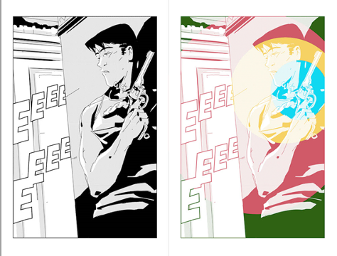
In visual storytelling it is essential tocontrol what the reader focuses on and that is why it is recommended to create visual bullseyes. This means that you should control the amount of visual activity the reader is exposed to by creating a dramatic focal point. Here is a very good example where the focus is on the hand gripping, the gun catches the reader’s eye, the background is clear and the shadow contrasts with the gun (Greenfield 2018
When deciding what format you want to use for your comic keep in mind that you can choose from working in Half-Pages or in Double-Pages. European comics tend to use a four-strip grid while US comics have a three-strip grid, but that is not the only way. You can also use half a page at a time or a full-page which allows you to include a more detailed work. The double-pages format is another visual approach which gives you even more space to tell your story across two pages at a time, you can opt for more detailed drawing, panels of different sizes and shapes and a variety of lettering. Illustrations spread over two pages are often used to highlight an epic or out of the ordinary situation, such as a breath-taking landscape, or an epic battle. It requires to make sure that the reader will see the two pages at the same time (for example, after turning a page).
How to get inspiration
Finding inspiration can be daunting at first, but it doesn’t have to be. When you start writing, brainstorm all your ideas and write everything down. Read and get inspired by comics that have elements you would like to include as well. And most importantly, draw inspiration from the world. You can find more information on this topic in lesson 23.
References
Books and articles
Greenfield, D., (2018) 13 Visual Storytelling Tips For Comics. [online] 13th Dimension, Comics, Creators, Culture. Available at: <https://13thdimension.com/13-visual-storytelling-tips-for-comics/>
mStoner. (2016) Comic Books + Web Design: The Art Of Storytelling – Mstoner. [online] Available at: <https://www.mstoner.com/blog/strategy/web-design-higher-education-comic-books-art-storytelling/>
Tevlin, T., (2014) How To Write A Script For Your Comic. [online] Makingcomics.com. Available at: <https://www.makingcomics.com/2014/03/08/write-script-comic/>
Images
Greenfield, D., (2018) 13 Visual Storytelling Tips For Comics. [online] 13th Dimension, Comics, Creators, Culture. Available at: <https://13thdimension.com/13-visual-storytelling-tips-for-comics/>
Wikimedia.org. (2020). [online] Available at: https://upload.wikimedia.org/wikipedia/en/8/84/Page_from_Astonishing_X-Men_no._14.jpg
Panel
I’ve Been Framed! – Framing Comic Panels. (2014). Makingcomics.Com. Available at: https://www.makingcomics.com/2014/03/31/ive-been-framed-comic-panels/
Gutter
Comic vocabulary Flashcards | Quizlet. (2020). Quizlet. Available at: https://quizlet.com/es/274715499/comic-vocabulary-flash-cards/
Tier
Architecture of The Comics Page. (2011, August 24). Graphic Universe Blog; Graphic Universe blog. Available at: https://graphicuniverse.wordpress.com/2011/08/24/architecture-of-the-comics-page/
Splash
Splash Panel – TV Tropes. (2020). TV Tropes. Available at: https://tvtropes.org/pmwiki/pmwiki.php/Main/SplashPanel
Spread
(2020). Pinimg.Com. Available at: https://i.pinimg.com/originals/32/52/20/3252201ecdcd2f507fc639ffb2812826.jpg
Caption
Birge, S. (2010). No Life Lessons Here: Comics, Autism, and Empathetic Scholarship. Disability Studies Quarterly, 30(1). Available at: https://dsq-sds.org/article/view/1067/1255
Speech Bubble
Thorn, K. (2013, October 6). Step 4: #Sketchnotes: Headers, Titles, Captions, and Speech Bubbles. Nuggethead.Net. Available at: https://nuggethead.net/2013/10/sketchnotes-headers-titles-captions-and-speech-bubbles/
HAVE A GO AT CREATING YOUR FIRST STRIP!
Duration: 60 minutes Objectives: The objective of this lesson is to have a better understanding of the decision process that goes behind using a comic in the classroom and to create your first comic Desirable outcomes and competences: By the end of this lesson the learners will be able to create their first comic. |
Decision Process
Now that you have decided to use a comic strip in your class there are a few more things you should keep in mind such as: using pre-existing comics or your own, age appropriate comic strips, is your use of comics in the classroom time-bound?, learning outcomes, tools and inspiration.
‘Philip the frog and Katie the cat’ is a comic strip created in Chapter 3 Part 1 and it will be used to analyse the bullet points mentioned above.
Pre-existing comic or your own
There will always be a debate on whether you should use a pre-existing comic strip or create your own. It is up to you, because both options are equally good for teaching.
In my case, I have decided to create my own comic because I believe it encourages my students to use their imagination, improves their writing skills and vocabulary and it will create a personal bond with the characters which will motivate them to participate more.
My students (ages 8-10) have chosen the characters and given them their names. So, here we have Philip the frog – our presenter and Katie the cat – one of the contestants. When we had to decide the names, we wrote a list of possible names on the whiteboard suggested by my students and then they voted for their favourite one. They have also chosen the animals which ended up rhyming with the name.
Age appropriateness
When deciding what comic to use you have to think of the age group you’re aiming at. Make sure the story and the images are appropriate for your group. Many comics could contain scenes of extreme violence or inappropriate situations. Also, think what type of comics your students would like depending on their age. Some might find certain stories childish or boring and we want to avoid that if possible, because if the students lose interest or motivation they won’t participate as much in the activities you have prepared and won’t learn or improve.
Time
How long are you going to use the comic for? Do you plan on using it once in class or during several classes in a longer period of time?
In the case of ‘Philip the frog’ I wanted to use the comic strip only once during a lesson. My students and I created the comic strip together (from choosing the characters to designing the comic strip) which gave me the opportunity to practice speaking (students had to negotiate different ideas and make decisions as a group in English), to practice writing and vocabulary (adjectives).
On the other hand, if you are thinking of using comics for a long period of time (a semester or more) here are some things you have to consider: you or your students could create a set of characters that can be used in different situations. You could divide your comic into chapters or seasons and write the story step by step during a month, a semester or even a year.
Learning outcomes
One of the first things you have to consider is the learning outcomes of your lesson. What do you want to achieve by using a specific comic strip in your class?
Think about:
- what skill you want your students to practice (reading, writing, speaking, listening)
- if you want to include new vocabulary or revise previously learnt vocabulary
- if you want to practice grammar (and be specific: is it present simple, conditionals, reported speech, etc.)
- what cultural aspects you would like to teach (politeness, greeting, humour, etc.)
With ‘Philip the frog’ my students practiced speaking and writing. They learnt new adjectives and reviewed some adjectives that we have previously seen in our lessons.
Tools and inspiration
In Lesson 15 you can find different tools you could use to create your comic and in Lesson 23 there is a list of websites and videos that could guide you through your creative process. Make sure you choose the appropriate tools for your students based on their experience using a computer or an online platform (think if they are beginner or advanced users).
For my comic strip, I’ve decided to use www.makebeliefcomix.com – a very simple tool to use – because I believed it was the most appropriate for the age of my students (8-10 years old). This website is very basic, it gives you the possibility to create between 3 to 18 panels, there is a variety of characters you can choose from, as well as different backgrounds and objects to decorate your panels. My students went through the list of characters and they’ve chosen the ones they liked the most (a frog, a cat, and 2 more animals in the background that don’t speak). We kept the background simple by using plain colours and we added different objects to complete the scene (a table, microphone, etc).
Step by step
Let’s get started!
In Lesson 11 you read about how to write a plot and a script for your comic and in Lesson 10 you looked at different techniques to help you in this process. Now let’s put them into practice.
Brainstorm ideas
When I decided to create the comic ‘Philip the frog’ I didn’t know the name of my characters or the animals that I was going to use. I knew I was going to let my students decide that, but I knew that I wanted to create a comic using animals and I knew I wanted to practice adjectives expressing feelings with my students. I started writing down different ideas that could combine those two items. Among those ideas I wrote: a scene from a school play, a discussion in a classroom, a song competition (I was thinking about Eurovisionbecause my students love it). In the end I chose a game that we often play in the classroom: Jeopardy and combined it with a song that gives me the adjectives I wanted to practice.
Choose your learning outcomes (what is the purpose of this comic strip; what will your students practise?)
As previously mentioned, I wanted to practice the use of adjectives to express feelings. We had already done a lesson on this topic where my students had learnt a series of adjectives and now, I wanted them to practice those adjectives and learn some new ones through this comic strip.
Create your characters
The characters were created together with my students. I told them the plot that I had created (three animal friends are participating in the famous competition called Jeopardy and they have to answer one more question to win the big prize. This is based on a song.) and we brainstormed name ideas and the animals they wanted to use. Then, I showed them the tool we were going to use (www.makebeliefcomix.com) and they chose their favourite characters from the list provided.
Write your plot
Usually you write your plot after you create your characters, but in my case because I wanted to get my students involved in the process, I had written the plot on my own and we chose the characters after. As you can see, the order of these steps is just a suggestion. You may change and adapt them to your needs.
Add the dialogue
As illustrated in Lesson 11, the dialogue is a very important part as it brings your characters to life. I wrote down on a piece of paper the line of each character. In this strip it was fairly easy as it is a short one (only 4 panels) and it included lyrics from a song. But I strongly recommend writing the dialogue after you have created your plot as it gives you the opportunity to act it out and see if it is realistic and natural or if you need to make any changes. In addition, it will help you to make sure that you have enough space in your comic to put the text.
Transform it into a script
I wrote a short script (check Lesson 11) that I gave my students to help them design the comic. This was a short reading exercise for them and it was used to guide them and to help them visualise the final result.
Organise your page (design, storytelling techniques, panels, etc.)
You can do this step by yourself, or you can get your students involved. In my case, I made the decision on my own (the colour scheme, panels, techniques) and I explained them to my students and guided them in organising our strip.
Choose your tool
My tool of choice for this class was www.makebeliefcomix.com
There are other tools you can use (check Lesson 15).
Bring your story to life (put everything together)
Adapt it to the type of activity you want to use in class (gap fill, open-ending story, reading and vocabulary, etc.)
My strip was an open-ending story. I left a blank speech bubble in the last panel for my students to complete. After creating the comic strip together (the dialogue provided by me), we acted it out and my students had to identify the adjectives and give me a short definition or an example to show they’ve understood the meaning. After that, they had some time to finish the story in small groups and present it to the class.
Based on the above, the learners can now practice and create their own first strip. You can share it with us on the EdComix Facebook page.
STORYBOARD AND GRAPHIC LAYOUT: VOCABULARY
Duration: 60 minutes Objectives: The objective of this lesson is to introduce the trainee to the key terms of storyboarding and graphic designing. Desirable outcomes and competences: By the end of the lesson, learners should be able to:
|
This lesson presents the main concepts you will need in order to understand the storyboarding and graphic design processes, as well as study relevant introductory literature on the subjects.
Although classifying these concepts can be a challenge, an attempt to loosely organise the concepts in the categories of general, character placement, text, and colour has been made.
Key-terms
General
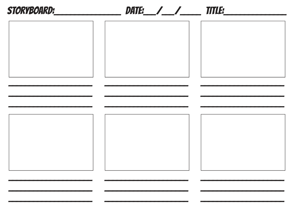
- Storyboard
A storyboard is a visual representation of the main events of a story. It is often used as planning tool by comics-makers and many other professionals including educators of all levels.
An example:
Source: https://www.slideshare.net/ProfessorNordell/storyboard-39777511
- Storyboard template
A storyboard template is a ready-made document helping you organise the scenes you will include in your storyboard. The templates can be drawn by hand or can be in a digital form that can be downloaded from the web.
Here is an example:
Source: https://an-nasihah.com/project/storyboard-template/
- Frame
A storyboard is made-up of individual frames, i.e. square or rectangular boxes. Each frame shows a specific moment or event in a story. Each storyboard should contain enough frames to make the flow of the story easily understandable.
Here is an example:
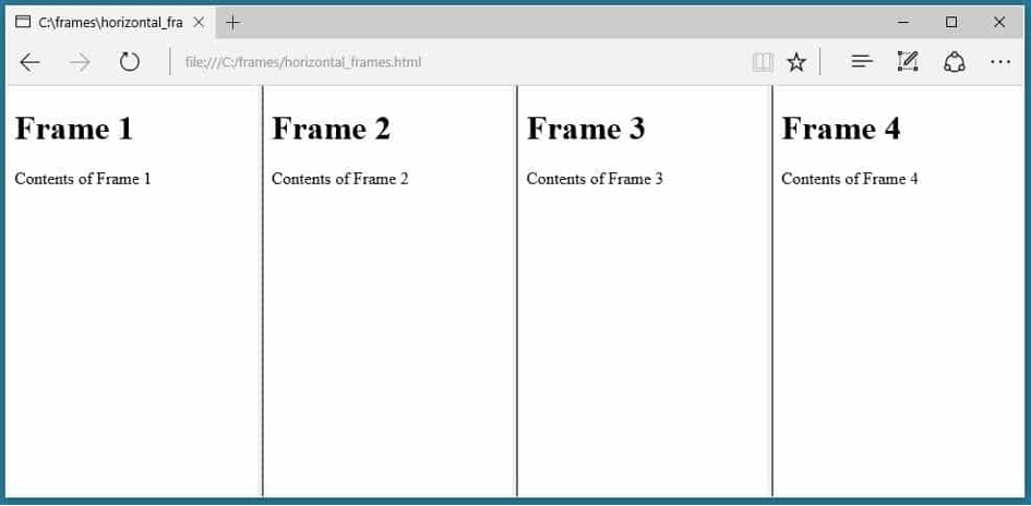
Source: https://html.com/frames/
- Graphic design
Graphic design is the process of visual communication through the combination of typography, photography, iconography and illustration.
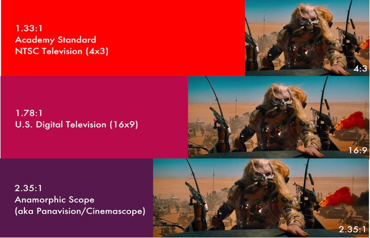
- Aspect ratio
Aspect ratio refers to the relationship between the width and the height of an image. They are written as two numbers with a colon (:) separating them. The first number represents the width of the image, and the second the height. Some well-known aspect ratios are:
1:1 (square shape)
16:9 (widescreen shape)
4:3 (traditional TV screen shape)
Here is an example:
- Rough sketches and scamped images
The first version of a storyboard should be drawn by rough sketches. This process is called scamping. The purpose of a scamped storyboard is to help make sense of the story and quickly make changes, as needed. A scamped storyboard is often made up by stick figures.
Character placement
- Shot
A shot is a series of continuous actions. Normally it is represented by a series of frames. The shots should be numbered. Often, numbering is straightforward numerical order (1,2,3, etc). Other times, frames are grouped together by combining numbers with letters, e.g. 1a, 1b, 1c. In film storyboards, shots might be numbered in increments of 10 (010, 020, 030, 040), so as to easily add new shots (e.g. shot 025 between shots 020 and 030).
- Shot types
There are many ways to frame an object or a subject in a shot. Some common ways to call different types of shots are the following:

Source: https://www.ahsvideo.com/examples-of-video-shots.html
And here are a few more:
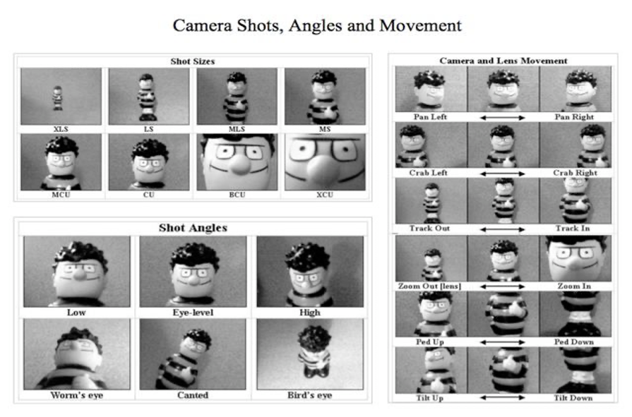
Source: https://realuca.wordpress.com/2015/03/30/types-of-shots-camera-movements-and-film-cut/
- Layering
Layering is the process of putting objects and subjects of a scene within different layers (foreground, middle-ground, background) of a frame. Its purpose is to depict location and distance between objects and subjects. It also creates an illusion of depth to the scenes.
Foreground is the area closest to the viewer.
Middle ground is the area at the centre of a frame, between background and foreground.
Background is the area furthest from the viewer, behind the middle ground.
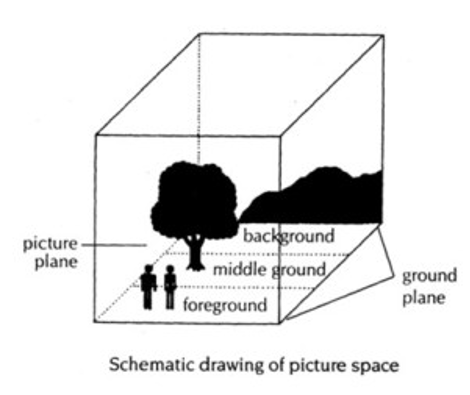
Source: https://comicbookglossary.wordpress.com/foreground/
- Rule of thirds
To use the rule of thirds, apply a 3×3 grid to your image, ensuring that the subject of the image is well-placed in the grid.
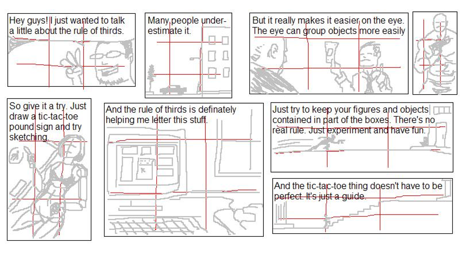
Source: https://www.deviantart.com/eddiechinglives/art/More-rule-of-thirds-205306765
Text
- Script
The script is the textual version of a storyboard. A script can be an outline of what will happen in the story or a much more complex text giving details as to transitions, the main events per se, etc.
- Dialogue
A dialogue is a conversation between two or more characters in a story. Dialogue is used to animate the characters, as well as depict/represent things like inner thoughts and feelings that the image alone may fail to depict.
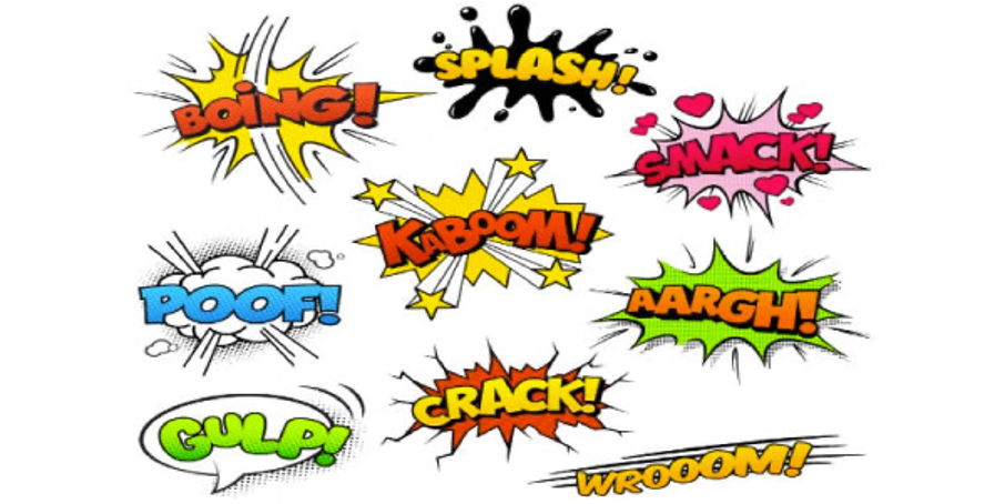
- Onomatopeia
Onomatopeia refers to the formation and use of words such as buzz that imitate the sounds associated with the objects or actions they refer to.
Source: https://loveenglish.org/onomatopoeia/
- Typography
The visual component of the written word. All visually displayed text, whether on paper, screen or billboard, involves typography.
- Lettering
The act of creating or placing letters in comics. It can be done by hand or digitally. Lettering is a separate art itself. However, some basic tips are these:
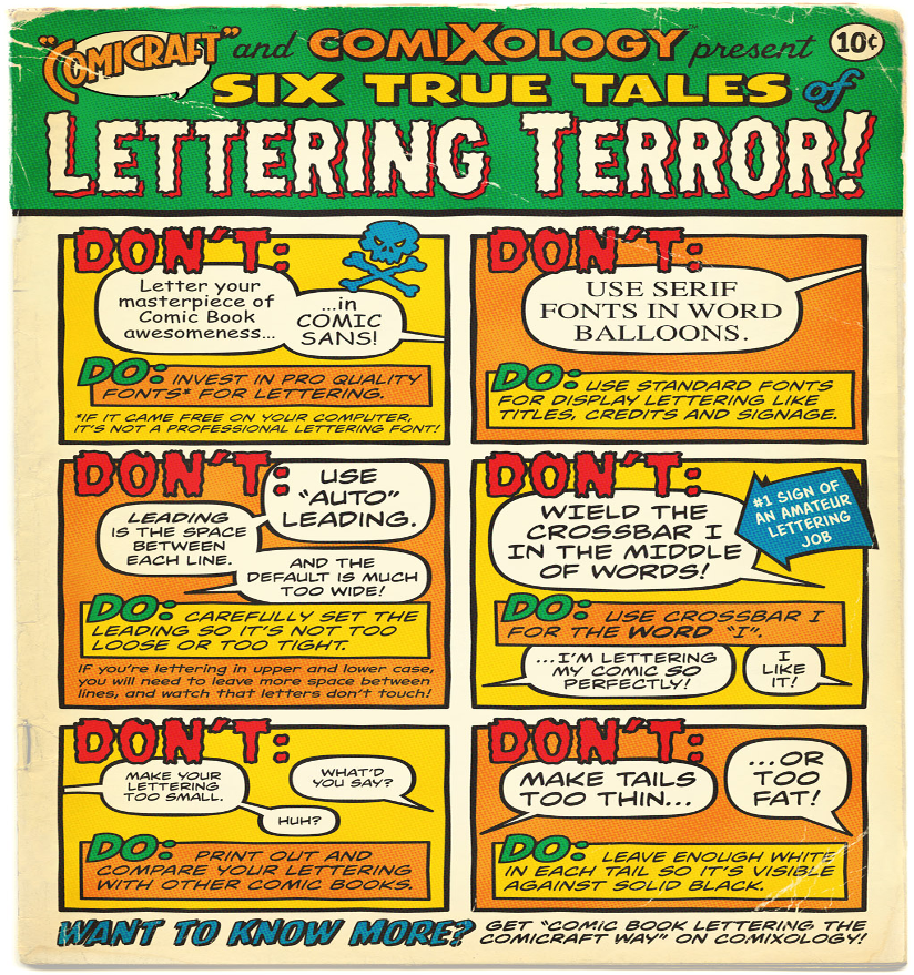
Source: https://i2.wp.com/www.balloontales.com/wp-content/uploads/2017/04/Comicraft_DosDonts_onepage_v1.jpg
- Grawlix
Using something like &#$@#$! instead of a curse.
Colours
- Palette
The set of colours used to paint your comic.
- Monochrome
Images in one colour or different shades of one colour.
- Analogous colours
Colours that are next to each other on the colour wheel, believed to match well.
- Complementary colours
Colours that are opposite each other on the colour wheel, e.g. red and green.
- Warm colours
Red, orange, yellow and various combinations of these colours. They are believed to invoke/induce a cozy vibe.
- Cool colours
Blue, green, light purple and the like. They have the ability to calm and soothe.
- Hue
Another word for colour.
- Icon
An image representing an action or an object. For example, a pencil icon could represent someone writing or a pencil (object). Clarity is important when using icons.
- White space
The area of a design left blank. Also known as negative space.
- Resolution
Resolution determines the quality of an image. A high-resolution image is clear and crisp, whereas a low-resolution one is blurry. Resolution is measured in pixels per inch (ppi). 300 ppi is considered high-resolution and 72 ppi low.
- Contrast
When two elements on a page are different. For example dark vs. light colours. Contrast is used to grab attention.
References
Buffer Library. 53 design terms explained for marketers. Retrieved from : https://buffer.com/library/53-design-terms-explained-for-marketers/ (2020, August 10th)
Canva. 50 design terms explained simply for non-designers. Retrieved from:https://www.canva.com/learn/graphic-design-terms/ (2020, August 15th)
Decker. K. (2016). 99 descriptive design words you should know. Retrieved from: https://99designs.com/blog/tips/15-descriptive-design-words-you-should-know/ (2020, August 10th)
Stevenson, O. (2020), 120 graphic design terms to help cut through the jargon. Retrieved from: https://www.shillingtoneducation.com/blog/graphic-design-terms/ (2020, August 10th).
The Free Dictionary by Farlex. https://www.thefreedictionary.com/
STORYBOARD AND GRAPHIC LAYOUT: PRINCIPLES AND TECHNIQUES
Duration: 60 minutes Objectives: The objective of this lesson is to introduce you to some of the main principles and techniques behind storyboarding and graphic layout. Desirable outcomes and competences: By the end of the lesson, learners should be able to:
|
This lesson presents the main techniques and principles you will need in order to understand the storyboarding and graphic design processes, as well as study relevant introductory literature.
First principle
The first thing to bear in mind is visual hierarchy, that is, the fact that using different colours, font sizes, bold fonts etc will cause certain elements or messages in your design to be perceived as more important and will be read first:
Source: https://www.reddit.com/r/web_design/comments/bzjjfr/visual_hierarchy_perfectly_illustrated/
Or, in a comics environment:
Source : https://derashworth.wordpress.com/activity-2-visual-hierarchy-weight/
In a way, all principles and techniques we will discuss here are ways of creating visual hierarchies using different elements of the design.
Second principle
The second thing to bear in mind is that your designs should feel stable and structured, by paying close attention to the shapes, text, boxes and images used, and how they relate to each other. This feeling of stability and structure is called balance. Check how symmetrical this comic strip is if you split it into three columns:
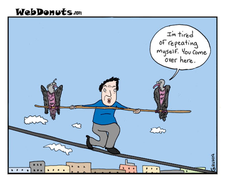
Source: https://www.webdonuts.com/2016/07/balance/
However, balance isn’t all about symmetry, it can also refer to assymetry. That means that the elements you use do not have to always be distributed evenly across the design, but you can use characteristics other than space (colour, size, etc) to create balance:
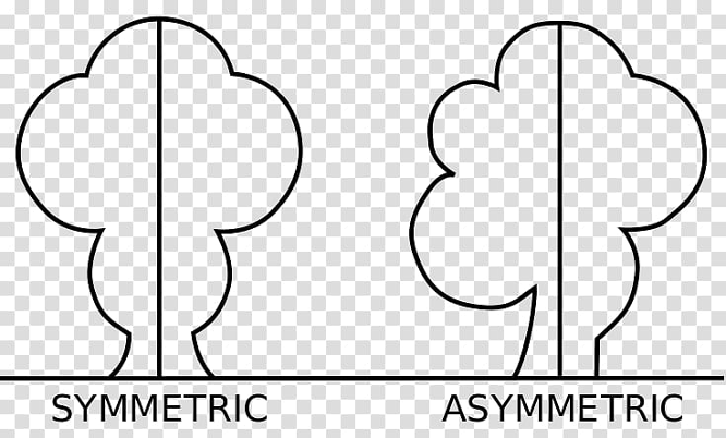
Source: https://www.pngguru.com/free-transparent-background-png-clipart-fvxdd
Techniques to create visual hierarchies and balance
Proximity
You can group related elements together either in space, or by using the same font, colour, size, etc. Check how the couple is presented in this strip:
Source: https://thecomicstrips.com/subject/The-Proximity-Comic-Strips.php
Alignment
You can create a visual connection between the design elements, by giving images, shapes and blocks of text an ordered appearance by eliminating elements placed in a dishevelled manner. How many examples of alignment can you see underneath?
Source: https://mooselicker.wordpress.com/held-back-comics/
Repetition
You can also tie together certain design elements by appropriate use of the colour palette, thus establishing a rhythm, making the design instantly recognisable, and strengthening the overall consistency of the design:
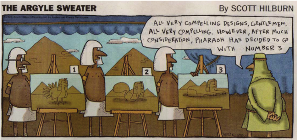
Source: https://www.researchgate.net/figure/Argyle-Sweater-cartoon-Repetition-of-the-phrase-All-very-compelling-in-this-context_fig1_279291354
Contrast
You can create a difference between two opposing design elements. The most common types of contrast are dark vs. light, contemporary vs. old-fashioned, and large vs. small: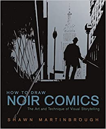
Source: https://www.amazon.com/How-Draw-Noir-Comics-Storytelling/dp/0823024067
Typography and fonts
The last element you should study closely is fonts and typography:
Source:https://gr.pinterest.com/pin/472315079648601962/?autologin=true&nic_v2=1a10UbUKL
However, in educational contexts it is important to remember that not all fonts are appropriate for all students. Therefore, the issue of inclusivity has to always be born in mind when selecting fonts that might be read by e.g. dyslexic students.
Breaking the rules
After becoming familiar with the foundations of design, the next step is learning to break the rules in appropriate ways and without compromising the message / goal of your design and lesson.
References
Cann, M.J. (2018). The 8 types of graphic design. Retrieved from: https://99designs.com/blog/tips/types-of-graphic-design/ (2020, August 5th)
Reid, M. (2019). The 7 principles of design. Retrieved from: https://99designs.com/blog/tips/principles-of-design/ (2020, August 5th)
Spacey, J. (2016). 20+ visual design techniques. Retrieved from: https://simplicable.com/new/visual-design (2020, August 5th)
Comic Book Graphic Design. Retrieved from: https://comicbookgraphicdesign.com/ (2020, August 5th)
Yates, I. (2011). The Mechanics of Comics. Retrieved from: https://design.tutsplus.com/tutorials/the-mechanics-of-comics–vector-1463 (2020, August 5th)
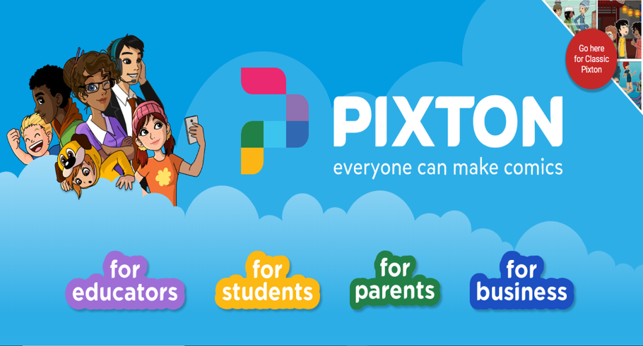
TRY TO CREATE YOUR COMIC WITH COMICS CREATION TOOLS: INTRODUCTION TO CANVA AND PIXTON
Duration: 60 minutes Objectives: The objective of this lesson is to introduce you to the use of Canva and Pixton to create comics for teaching purposes. Desirable outcomes and competences: By the end of the lesson, learners should be:
|
Before you start, it might be useful to sketch a rough sketch of what you want to create. That should help you decide what you’d like to include in the design and where.
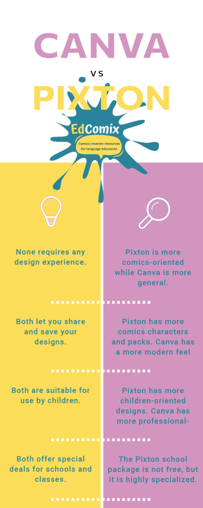
Then, the time to choose your tool has come! Do you think that Canva is the appropriate tool for your project or is it Pixton? That’s a difficult question to answer, but it all boils down to your own preferences at the end of the day.
Logging-in
After picking the tool and assuming that you’ve already signed-up for one or both tools, just go to the site and log-in using one of the pre-determined ways.
Pixton
- Go to https://www.pixton.com/ .
- Click the “For educators” button.
- Click “Log-in”.
- Use one of the options (facebook, account google account, etc) to log-in or set up your account.
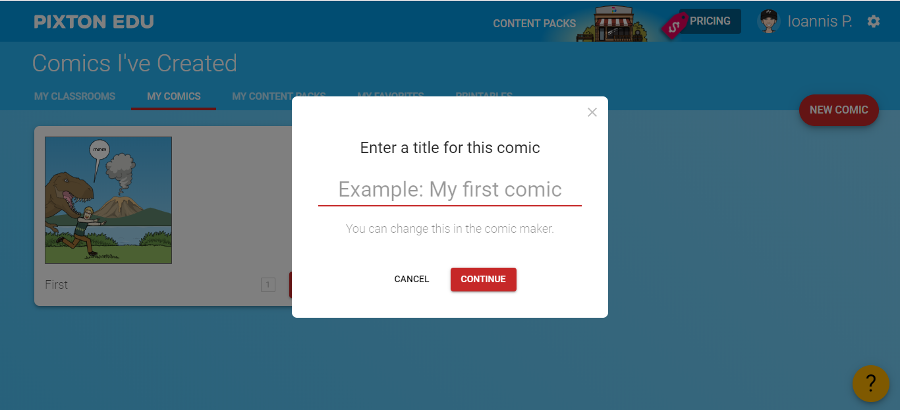
- You are now ready to start working on your first comic. To do that, start by clicking on the “My comics” tab you can see right in front of you.
- Click on the “New comic” button you can see on your right.
- Enter a title for the comic.
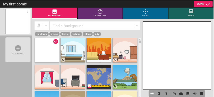
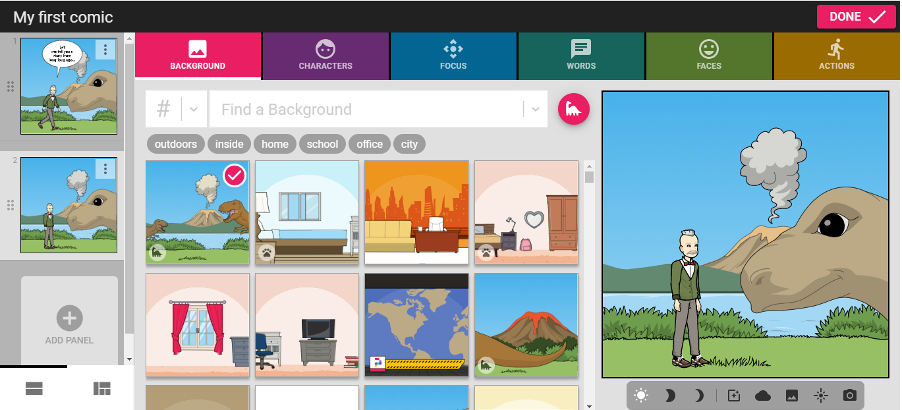
- You can now start designing. Start by clicking on the “Background” tab, and choose the background you want. Some might require payment, some are free.
- Click on the “Character” tab and choose your character.
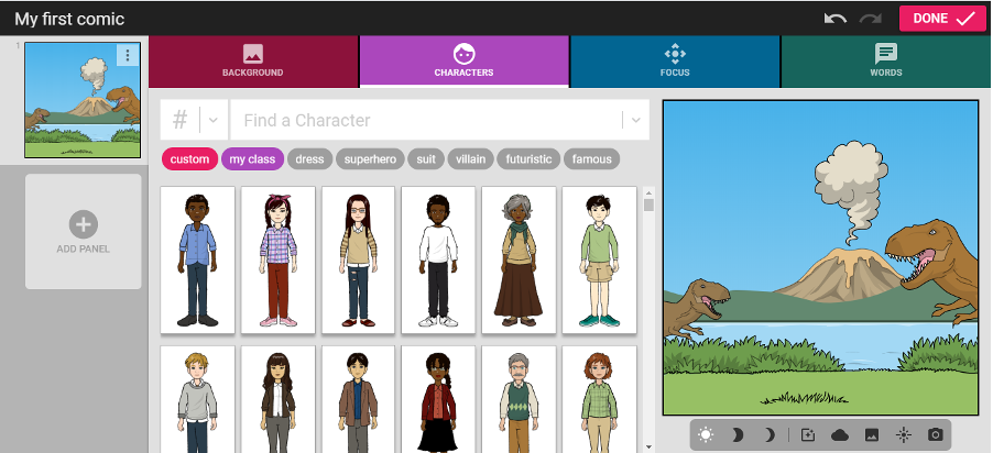
- Personalize your character according to your wishes. For example, you can add an outfit.
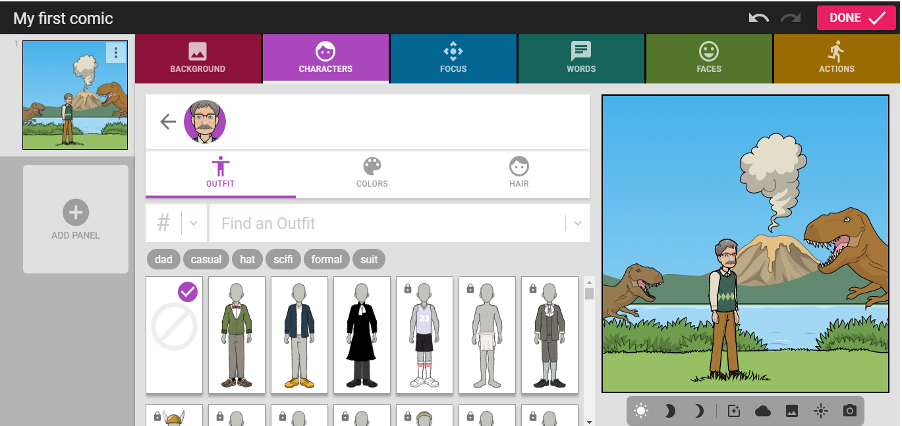
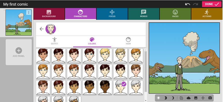
Then, you can choose colours.
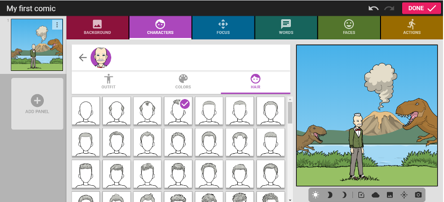
And hair style:
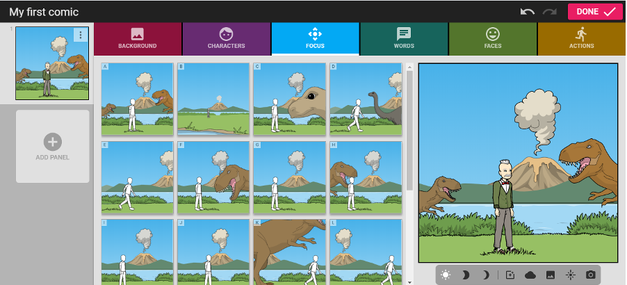
- Now, you can place your character in the scene. To begin with, click on the “Focus” tab, and choose the position you want for your character.
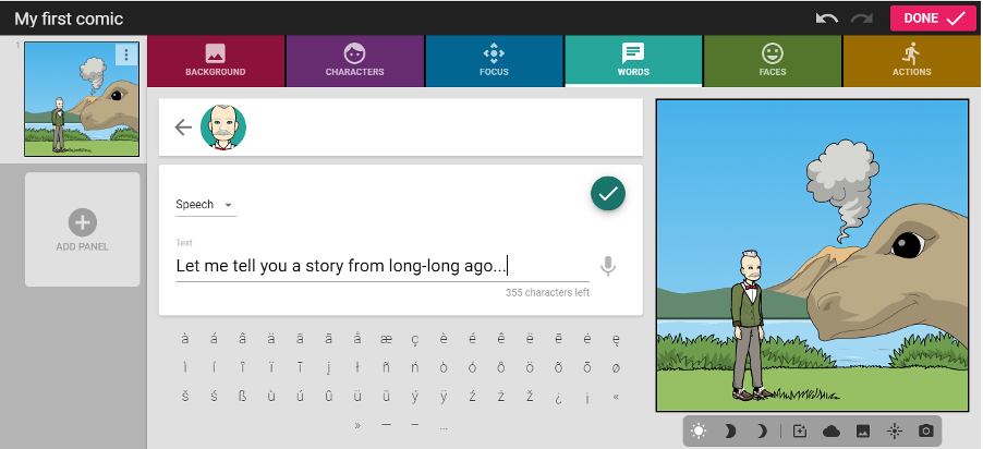
- Click on the “Words” tab and add words.
- Personalize your character’s face and actions according to your wishes by choosing from the options the tabs “Faces” and “Actions” give you.
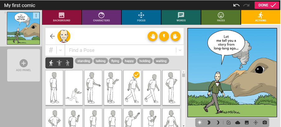
- The first panel is ready. Use the “Add panel” button on your left to add more panels.
- Continue adding panels using the same process. When done, click on the “Done” button on your top right. You are now ready to share.
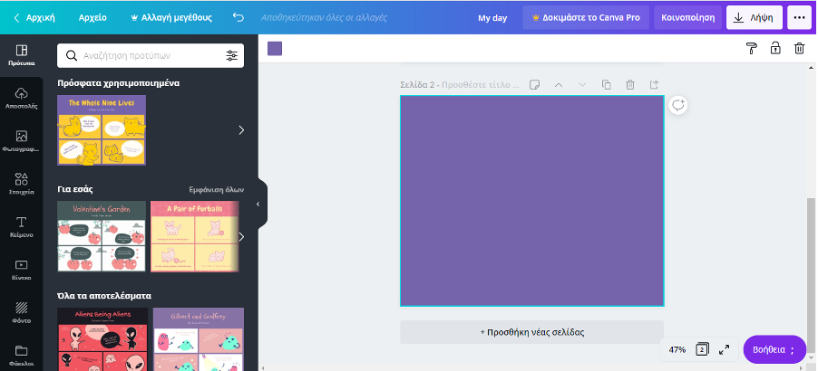
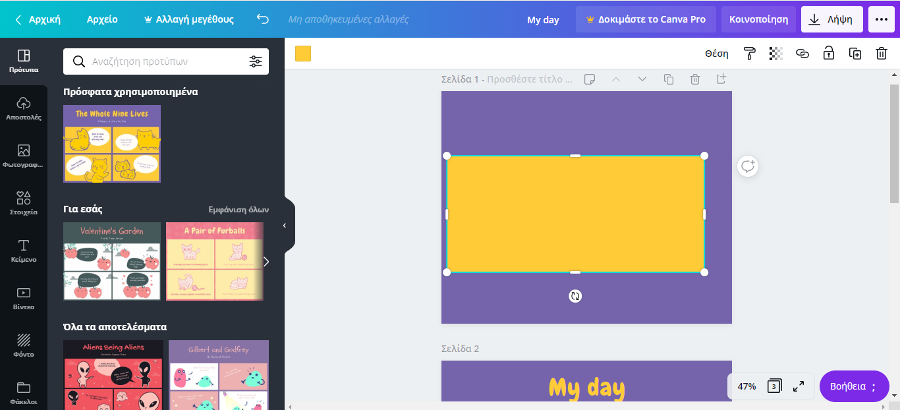
Canva
- Go to canva.com/ and click the “Log-in” button.
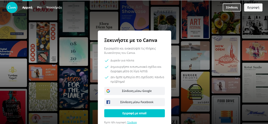
- Use one of the options (facebook account google account) to log-in or set up your account. Note that there might not have an option to change languages once you log-in.

- You are now ready to start working on your first comic. Click on the “Create a design” tab you can see on your top right, scroll down the drop-down menu and choose “comics”.
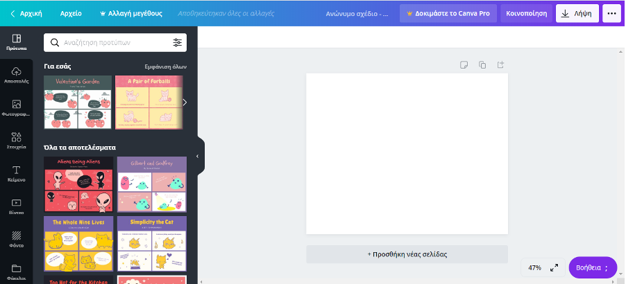
- Scroll-down “Templates” and choose one you want.

- By clicking on the text and the pictures you can erase or change them in the conventional way.

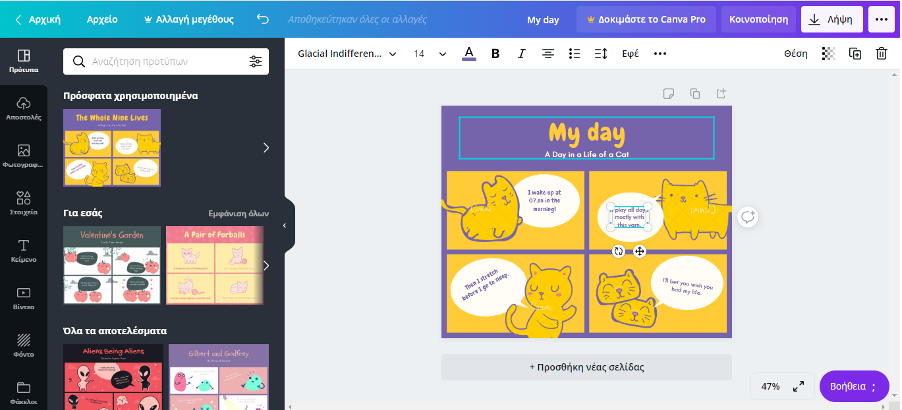
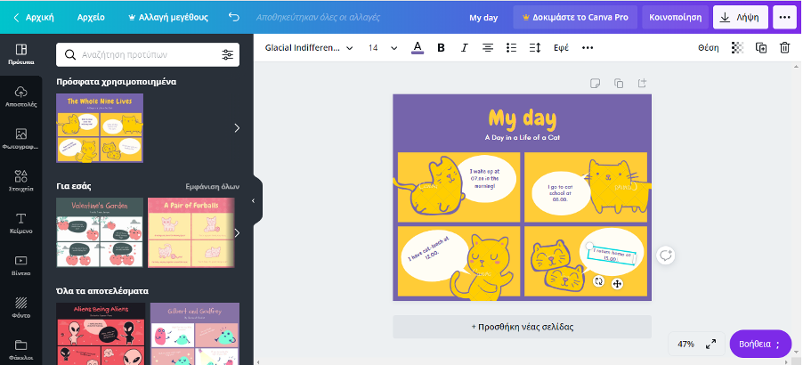
- Click “Add page” to add a page.
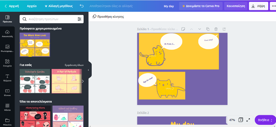
- How you can use the template parts to create a new comic. To do that, click on the panel from the template and press “Ctr+C” to copy. Then, click on the empty page and press “Ctr+V” to paste.
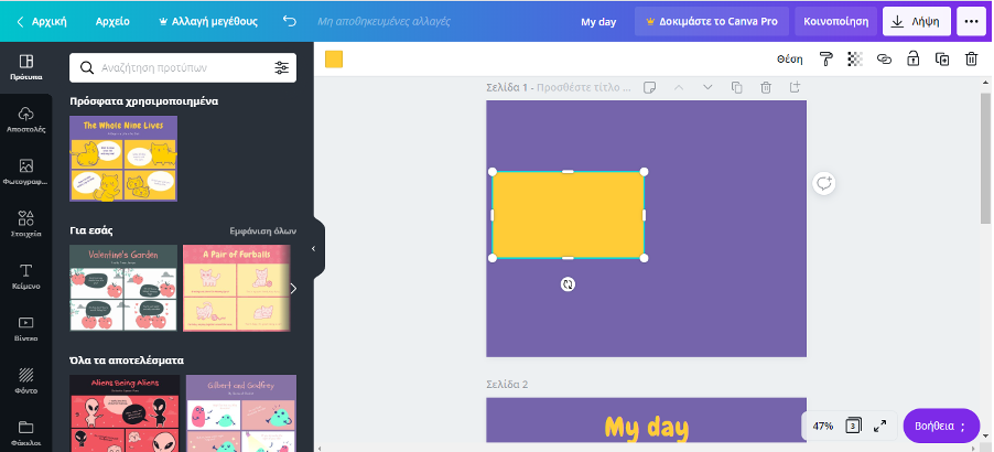
- Use conventional drag, drag and drop, etc techniques to move the panel around, change its size etc.
- Being creative, use the same technique to move and change anything you want, including objects, etc.
- Use the “Share” or “Download” buttons to save your work. Make sure you choose one of the free formats of downloading /sharing your content.
Comic creation troubleshooting: mistakes you might have made and how to improve your creation, including inclusiveness
Duration: 60 to 90 minutes Objectives: On completing this lesson, learners should be able to look at the comic they have created critically and to know how to improve most of the main beginners’ mistakes when creating a comic for the first time. Desirable outcomes and competences: By the end of the lesson, learners should be able to:
|
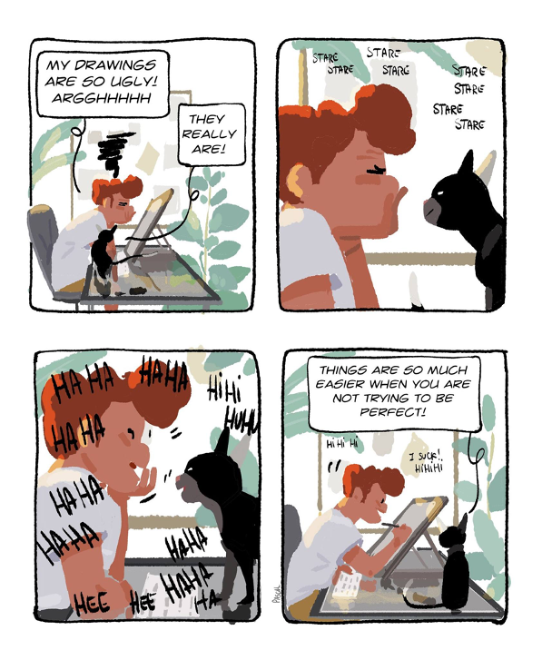
When you reach this lesson, you will have created your first comic. Congratulations! Take time to appreciate your efforts as the creative process, and getting out of your comfort zone in general, can feel rather tiring. You might not even find what you created to be that good.
Therefore, as an introduction to this lesson, let us remember that it may take an effort to actually let go of this vision that whatever you create has to be perfect if you want to present it. After all, even professional artists may find their creations ugly!
In this lesson, we will be looking at comic creation troubleshooting. In other words, we will be looking at how to review your work critically and solve the main problems you might have encountered in order to improve your work, should you feel the need to do so. As in the other lessons of this course, we will also bear in mind and add comments about troubleshooting and inclusiveness for learners with SLDs.
As this is not an illustration course, we will not tackle mistakes related to drawing per se, nor dive into complicated notions related to framing characters in different ways or to using more creative forms of panels for your pages. Remember that if you are not already used to drawing comics on a regular basis, it is perfectly ok as a teacher to create comics that might not look professional to you. Therefore, in this lesson we cover the main points that could hinder your students’ comprehension.
1. Mistakes in accomplishing the educational objectives through the created content
As you are creating comics to support your students’ learning process, mistakes in accomplishing the educational objectives are probably the first you should tackle. After all, if your comic does not work well with your lesson, it might end up looking like a weird addition to your course rather than a proper learning support. Here are three problems and how to troubleshoot them.
Your comic seems to come out of the blue:
One of the first things to remember is that using comics in your classroom is no magic wand for your lesson to suddenly become explicit to everyone.
When you have the idea to create a comic to fit into a specific lesson, you might end up struggling to find where to put it exactly, especially if it acts as the summary of several notions tackled during your lesson. Therefore, make sure to plan beforehand when and where you wish to add it in the flow of your lesson.
The relationship between your comic and your lesson is not clear:
This point follows the previous one closely. Even though the logic of where and when to use a comic in your lesson might feel obvious to you, it might not be the same for your students. To make sure everybody is on the same page and approaches the comic with a similar mindset, do not hesitate to accompany your comic with an introductory sentence or a short explanatory note, rather than just copy pasting it into the text of your lesson. If you tell your students what to look for in your comic, you encourage them to be in the right mindset from the start.
Your comic needs too many explanations:
To create a comic, you either created a story, setting and characters, or used external references. Either way, if they are too complicated or difficult to grasp by your students, you might end up having to write lengthy explanatory notes as to what the scene depicted in the comic represent. This would focus the readers’ attention away from the comic itself, and it might be more taxing for them to make the effort to understand what you wanted to show them. Therefore, try to keep things simple
If you focus on these three points, you should step closer to linking your comic to your educational objectives!
2. Troubles in the plot or in the script development
You may or may not practice your storytelling skills often, and even then, you might need different storytelling skills when creating a comic. Here are 3 tips to help you make a story that your students can understand to support their learning experience!
Your story is too rich:
It might be tempting to use the codes of a genre that your students like to fit your course content into. However, if you are not familiar with this genre, or if you try to put too many references, your story might be opaque to your readers. Especially when you create a comic strip or page, you should focus on keeping your story simple rather than overcrowding it with too many elements. Therefore, resist the temptation to add too many details as you go, and do not hesitate to take unnecessary elements out of your work when you finalise your first version.
Finding the right balance for your story can be challenging
If other readers find your story difficult to understand, it can either be linked to the previous point, or, on the contrary, you might not be telling enough, or telling things too fast. Then again, if you feel like you already added a lot of explanatory text to your story, then it might be worth making your comic a bit longer. Finding the balance between adding too many steps to a story or making it explicit enough can be tricky. Do not be afraid to realise that the idea you had for one story might actually provide material for several 🙂
You think that your storyline is rather flat:
Let us start this point by remembering that you might not create the next narration masterpiece — and this is okay. In addition, we are focusing here on creating short stories, and in that perspective, it is difficult to create a full and complex story.
Here are two storytelling mechanisms that you can use to make sure your creation is not too monotonous:
- You can either make sure that the situation you depict in your story has changed between the beginning and the end of the story. It does not need to be about detailed action, as it can concern the mood of the characters, their situation, or any other element of the story, etc.
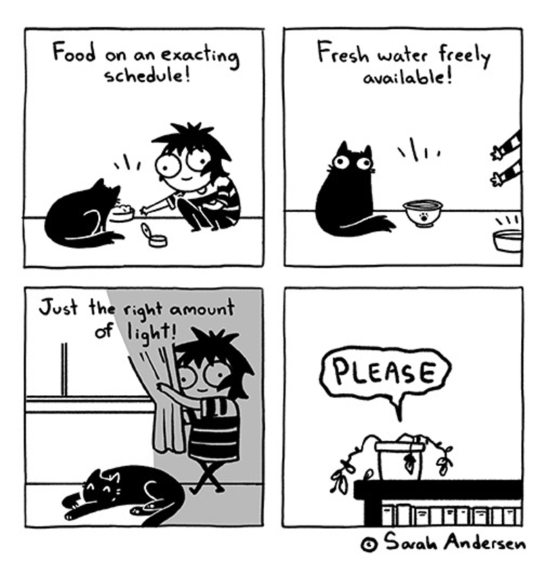
- The second mechanism you can use, if you do not tell a story that starts from point A to go to point B, is to tell something directly to your reader. For example, daily life webcomics give information or tell a story about a character that does not necessarily change but aim at making the reader relate to the character. You can find an example by Sarah Andersen (2020) below:
If you take time to consider the points above, your story is more likely to be understood by others!
3. Mistakes in illustration and text elements
We kept this part for the end of the lesson as it might appear to be the most technical. While we could not dive into artistic details, we chose to list the main challenges you might have encountered to create your comic to give you general principles on how to avoid them.
My comic looks messy overall
As said above, whenever what you create looks messy, it might be because you put too many things into it. Here are a few actions you can take to make your creation breathe:
- Check whether the background is clearly in the back: if your background is too rich or has too bright colours, it might hinder the visual flow of your comic. If it is the case, ask yourself whether the background is necessary at all, and if you prefer to keep it, use lighter colours or leave the elements of background in white while colouring the elements on the foreground.
- Look for the unnecessary elements in your comic: for example, do you need all the characters you put to be in your panel? If some characters do not bring anything to your story, you can decide to delete them as they might just be overcrowding your panel. You can either delete the unnecessary characters or zoom on the character who is the focus of the action.
- If you struggled to put all the text you wanted, do the same exercise than for visual elements in general and think about whether all the text you put really is necessary to understanding your story, and ultimately to achieving your educational objective. For example, if you created a very complicated super hero story, you might want to water it down to make sure it is easy to understand who plays what role rather than having to explain it.
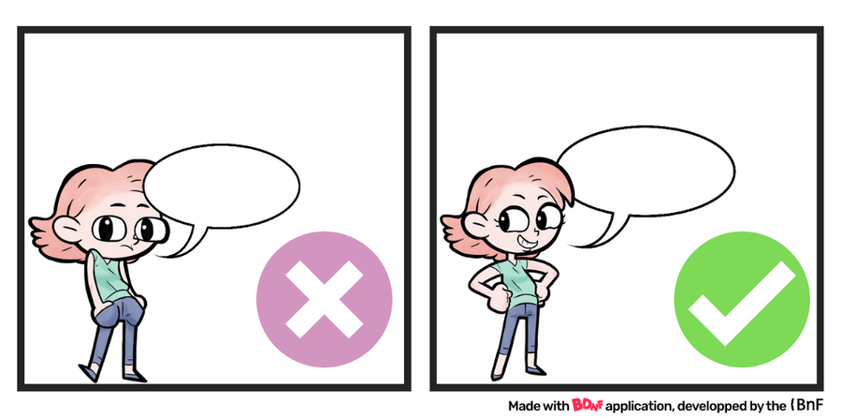
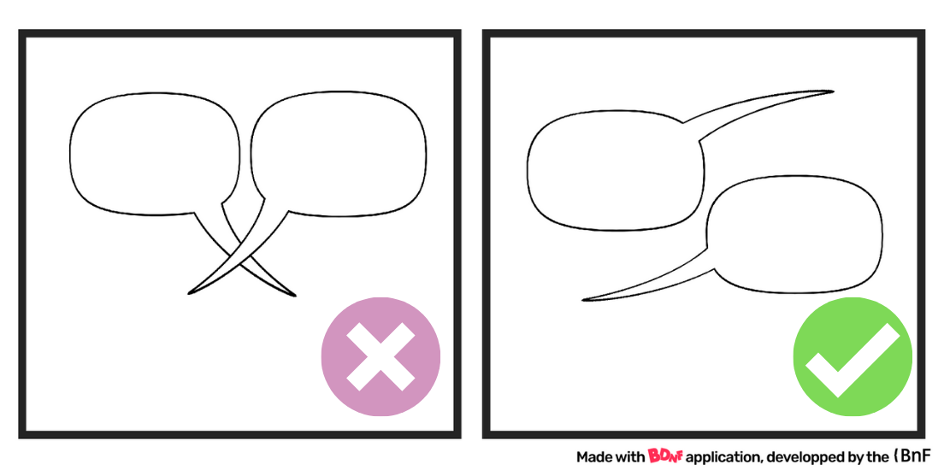
Mistakes in using speech balloons
Understanding the basic principles of how to use speech balloons can be relatively easy, but applying these principles can be challenging Take a look at the video below based on a comic strip created with BDNF in which we try to improve the use of bubbles and text.
There is one troubleshooting topic that we do not cover in this lesson. Lettering, or how the text is arranged, can be a source of problem when making comics. Further details can be found in lesson 5, in which you will learn about lettering with inclusive principles in mind!
With these tools now in your hand and summarised in the worksheet, you should be able to solve most of the problems you encountered when creating your comic. Just bear in mind that these are general principles to make sure a simple comic is easy to read: do not feel confused if you find professional artists doing the exact opposite of what we described in this lesson, as their artistic maturity allows them to take more risks 
References
Andersen, S. (2020) “Sarah’s Scribbles”. Retrieved from https://sarahcandersen.com/page/9
Campion, P. (2020) “Perfect Imperfection”. Retrieved from https://www.instagram.com/p/CCXu7jRDnG2/?utm_source=ig_web_copy_link
Media and Techniques
BnF (2020) “BDNF”. Retrieved from https://bdnf.bnf.fr/EN/index.html
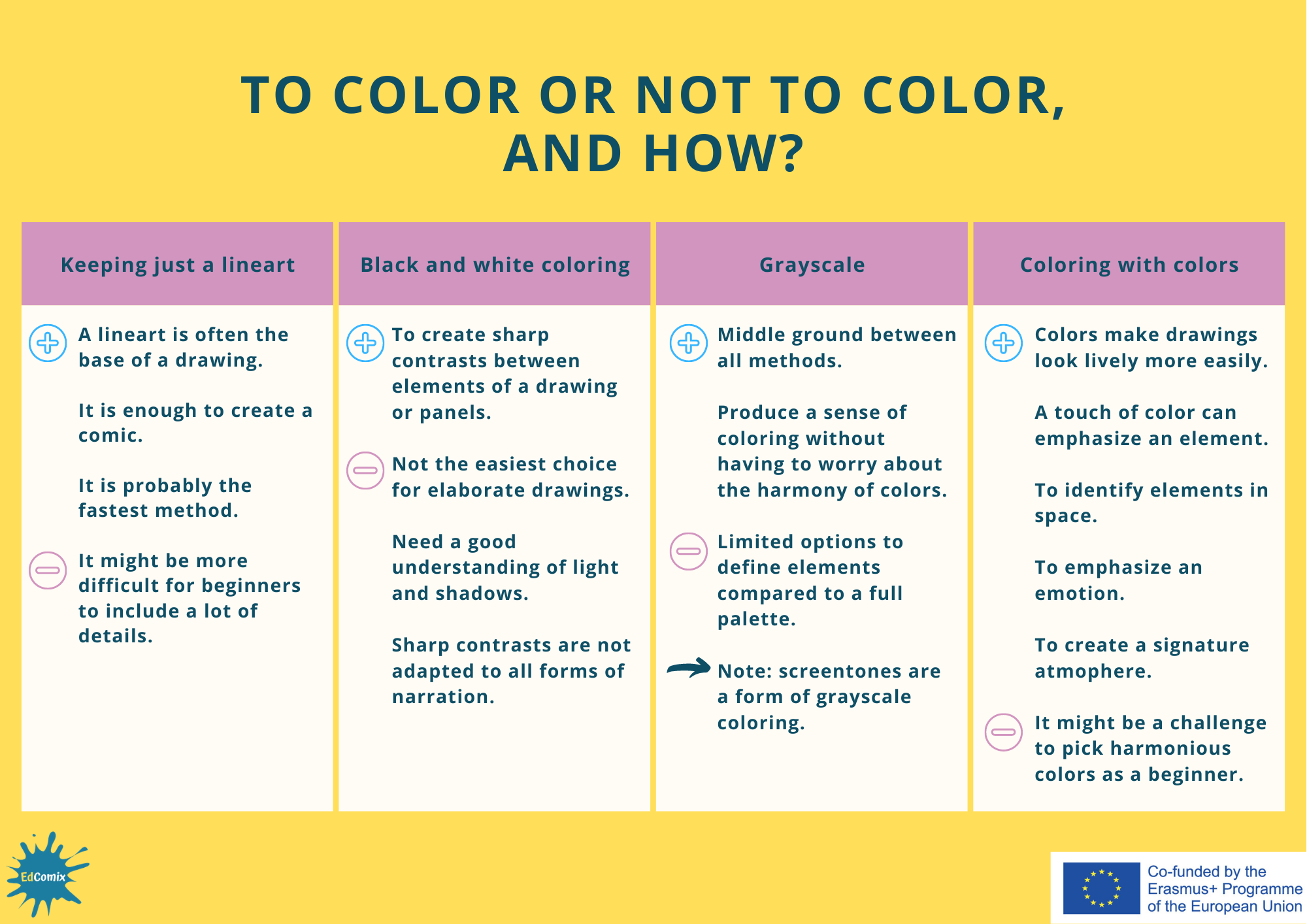
BLACK & WHITE, SHADES OF GREY OR COLOR
Duration: 45 to 60 minutes Objectives: At the end of this lesson, learners should be able to know how to prefer to color – or not ot color – their comics, and why. Desirable outcomes and competences: By the end of the lesson, learners should be able to:
|
Depending on your reading habits, you might encounter more comics in color or in black and white. Even in each type, there can be a variety of techniques and rendering. Depending on the types of comics you read the most, you might already have an idea of how you wish to color your comic, whether you leave your creation in black and white, use just shades of grey or color it. In some cases, you might think that you need to color your work to make it look better, but this might not necessarily be the case. On top of all this, you might ask yourself whether and how to color your comic regardless of whether you are creating it by hand or digitally.
All the options have different advantages and disadvantages, which we will explore in this lesson to support you in making the most appropriate choice for your use.
1. Using black and white
The most common vision of drawing often starts with a lineart
Most of us draw using lines, and this probably corresponds to the vision most of us have when thinking about the drawings of cartoons or comics. We generally think of them as first being drawn with lines, then possibly filled with colors, whatever the technique used.
This first phase of drawing shapes with lines is called a lineart.
Image 1 (The Boy And The Fairy)
Note: a lineart is not necessary to draw. If you are familiar with painting, you might be used to color shapes directly to create your drawing.
Image 2 (Kurzsgesagt, 2020)
Is a lineart enough to call it a drawing? Is it ok to use with your students, or are you worried it looks lazy if it is not colored? As long as what you create can be read and understood easily, then your creation is appropriate for your classroom, regardless of the technique used or artistic level.
Then, what is the difference between a lineart and black and white coloring?
In practice, how is black and white coloring any different from a lineart? Most of the times, a lineart will consist in black lines on a white background. Black and white coloring consists of the intentional filling of parts of the drawing in black, and leaving parts in white. Black and white coloring can be combined with a lineart, or can be used to create shapes directly (as you can see in the second strip below).

Image 3 (The Boy And The Fairy)
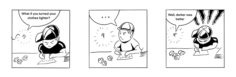
Image 4 (The Boy And The Fairy)
What are the pros and cons of black and white coloring over leaving a blank lineart?
Black and white coloring present several advantages, among which:
- Creating an atmosphere, for example mostly white for daytime and mostly black for the night;
- Making it easier to distinguish some elements of your image from others, especially in simple drawings;
- Creating sharp contrasts between panels.
However, black and white coloring also comes with challenges, regardless of whether you use it with or without a lineart:
- By definition, you will not have many choices of colors if you just use black and white, therefore, it might not be suitable for an elaborate drawing;
- If you use black and white to show shadows and volume, you will need to understand how light and shadows are cast on a scene, which is a skill that can be long to develop,
- Because of its contrasting power, black and white coloring can produce very expressive content that does not suit more casual forms of narration.
This was a short presentation of the pros and cons of black and white coloring. Most arguments could also be applied to the use of a two color palette. In any case, your choice of color, as well as the choice to use no form of coloring at all by just keeping the lineart, is an artistic choice. One can decide to keep the process as simple and as fast as possible, or choose their palette depending on the atmosphere they wish to create. For example, in the Cat’s Café webcomics series, the artist leaves black out of their color palette, by not even using black for the lineart, to focus on soft and lively colors in order to create a positive and peaceful atmosphere to their drawings.
Image 5 (Cat’s Café Comics, 2020)
2. Greyscale coloring
Greyscale coloring can be an interesting first step into coloring
Coloring in shades of grey, or grayscale coloring, can be seen as the crossroads between coloring with colors and black and white. It is a rather versatile technique that allows to provide a sense of coloring without having to worry too as much on the harmony of colors than when coloring with a colorful palette. It can be limited to dividing the elements in an image. For example, a character’s hair may be a darker grey than his skin, as could be a book on a table or a painting on a wall.
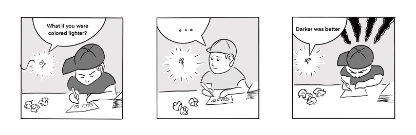
Image 6 (The Boy And The Fairy)
Grayscale also allows to provide a sense of depth to a drawing. In the example below, the elements in the background are the clearest (the sky and clouds), and the closer the elements go to the foreground (the mountains), the darker they look.

Image 7
Note: It is interesting to note that modern manga artists generally color their work in shades of grey, in this case using screentone rather than grey. A screentone is originally a sheet of tracing paper at the back of which a motive in black is printed. The artist scratches the screentone selectively onto their drawing to “color” it. The most common motive is black dots regularly spaced to create the illusion of a shade of grey (see image below). Therefore, in the case of manga, grayscale is the most neutral way of coloring.
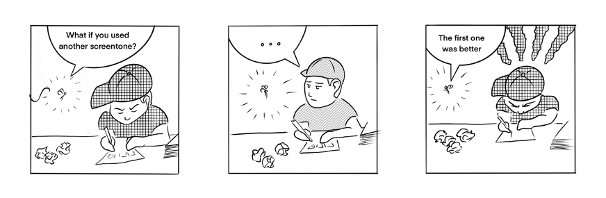
Image 8 (The Boy And The Fairy)
It is better for beginners not to use too many shades of grey
However, the main disadvantage of grayscale coloring is that it makes it more difficult to create very detailed palettes or elements in smaller images compared to using colors. Although there is no need to worry about combining different colors, the designer has to be careful with the difference of the greys they use to differentiate between elements. When changing the grey shades of a drawing, it is important to provide sufficient contrast so that the comic remains legible.
3. How and why use colors for your comics
As we have seen above, coloring is optional in illustrating. As with any other tool from the creator’s toolbox, it is best used when it makes the reading process easier. Here are four examples of how colors can support your readers’ eyes in grasping your illustrations better and faster (see images 9 to 12).
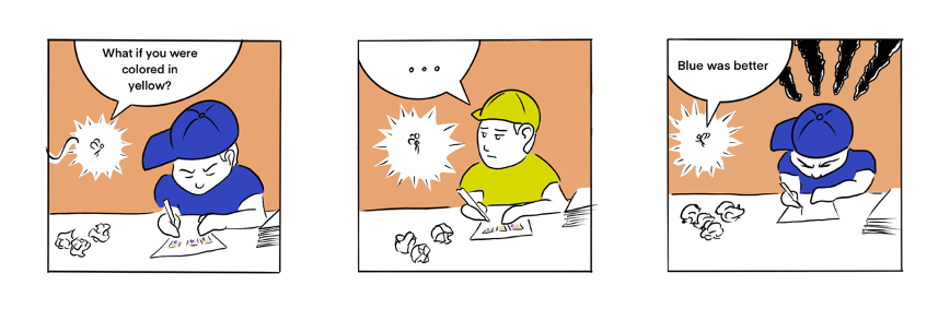
Image 9 (The Boy And The Fairy)
Emphasizing an element
If you find using colors initimidating, or if you really want to emphasize an element of your comic, you can use a touch of color with a lineart, a black and white or a grayscale drawing.
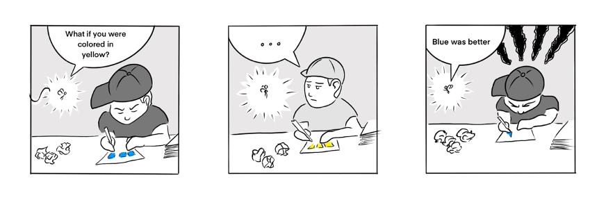
Image 10 (The Boy And The Fairy)
Identify elements in space
Beyond the elements composing a character, a scenery or background can also be the subject of a particular attention in colorization. As with shades of grey, coloring can be used to provide a sense of depth and to define the place of the different elements in the picture more clearly.
Emphasizing an emotion
While it is possible to convey emotions using black and white or shades of grey, they will generally appear “rawer” and they could be perceived in a negative way. Colors will illustrate the emotions of the characters or the atmosphere of a setting more clearly.
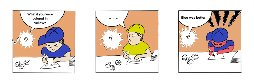
Image 11 (The Boy And The Fairy)
To create an atmosphere thanks to a limited color palette
Just like colors can play a role in the depiction of emotions, a color palette can be used to represent a setting or general atmosphere. Let’s take the example of graphic novel “300” (Miller & Varley, 1999), in which the illustrator favoured a bronze tone reflecting the warmth of Mediterranean Greece and referring to the Peplum film genre.
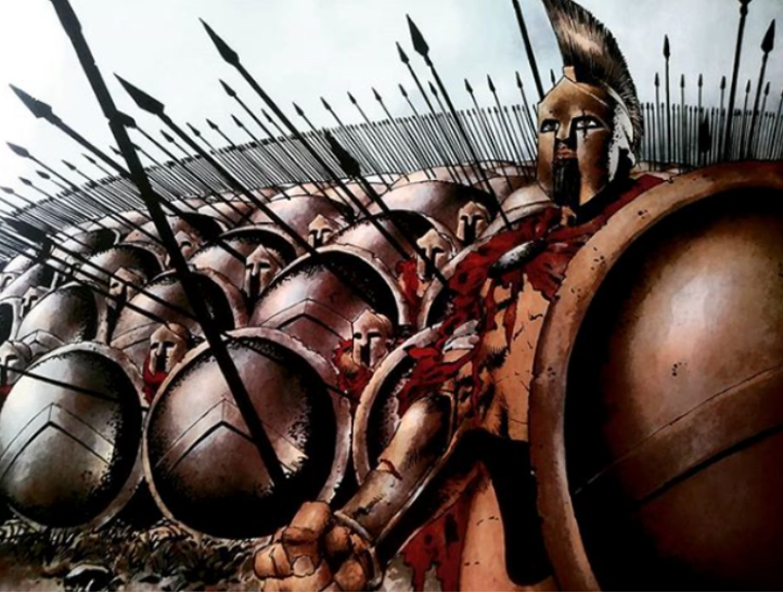
Image 12 (Miller & Varley, 1999)
References
- Published by kurzgesagt on Instagram, 21st december 2019
https://www.instagram.com/p/B6VhE7fq6-k/?utm_source=ig_web_copy_link
- Published by catscafecomics on Instagram, 10th July 2020
https://www.instagram.com/p/CCdtQ-MjmwB/?utm_source=ig_web_copy_link
- Miller, F. & Varley, L. (1999) Dark Horse, United States
USING YOUR CREATIONS IN YOUR LESSONS AND GETTING FEEDBACK FROM STUDENTS AND COLLEAGUES
Duration: 60 minutes
Objectives: To be able to receive positive and negative feedback from your students and colleagues; to be able to explain to your colleagues why comics can be useful in the classroom
Desirable outcomes and competences: By the end of this lesson you will have a better understanding of how to deal with feedback; you will be prepared to talk to your colleagues about comics and their value. |
Expectations vs. reality: how to take positive and negative feedback
Negative feedback
When receiving feedback, positive or negative, people tend to be defensive and they do not always see it as being constructive. Feedback can challenge their views about themselves and it can create a sense of discomfort. This is why it is important to create good rapport between both individuals and to make sure that the emotional state of the receiver is protected. It should be noted that negative feedback can also be perceived as criticism which might trigger feelings of shame and guilt. Therefore, as a teacher, it is important to build a safe feedback environment where students and teachers feel comfortable, supported, and where feelings can be discussed, especially when mistakes are made.
Differences between feedback and criticism
It might be difficult to differentiate feedback from criticism, but it is important to understand that criticism has the negative purpose of making someone feel bad about what they did while feedback aims at helping them improve.
| Criticism | Feedback |
| “This teacher is picking on me.” | “This teacher cares about me. They’re trying to help me.” |
| “This teacher thinks I’m bad at this.” | “This teacher gives me advice because they must believe I can improve.” |
| “I’m angry. I feel embarrassed.” | “I’m thankful my teacher is telling me how I can do better.” |
| “I want to give up. I will never be able to do this as good as this teacher wants me to.” | “I will do my best to do the things my teacher suggests. I will see if it helps me to improve.” |
Receiving Feedback
It is also important to learn how to receive and interpret feedback when it is given to you. It is important to listen carefully to what the other person has to say and not respond to them until the message has been carefully analysed.
Analyse if it is meant as criticism or it could be interpreted as feedback. Will this make me better or will it make me feel bad? This analysis requires a high level of emotional intelligence, but, as teachers, we can help others to develop those skills.
What’s more, enabling the learner to have an active role in their feedback conversation will not only make them more assertive and emotionally stronger, but also provides further motivation to change.
Effective Feedback
The most effective feedback requires empathy, strong communication skills, and trust.
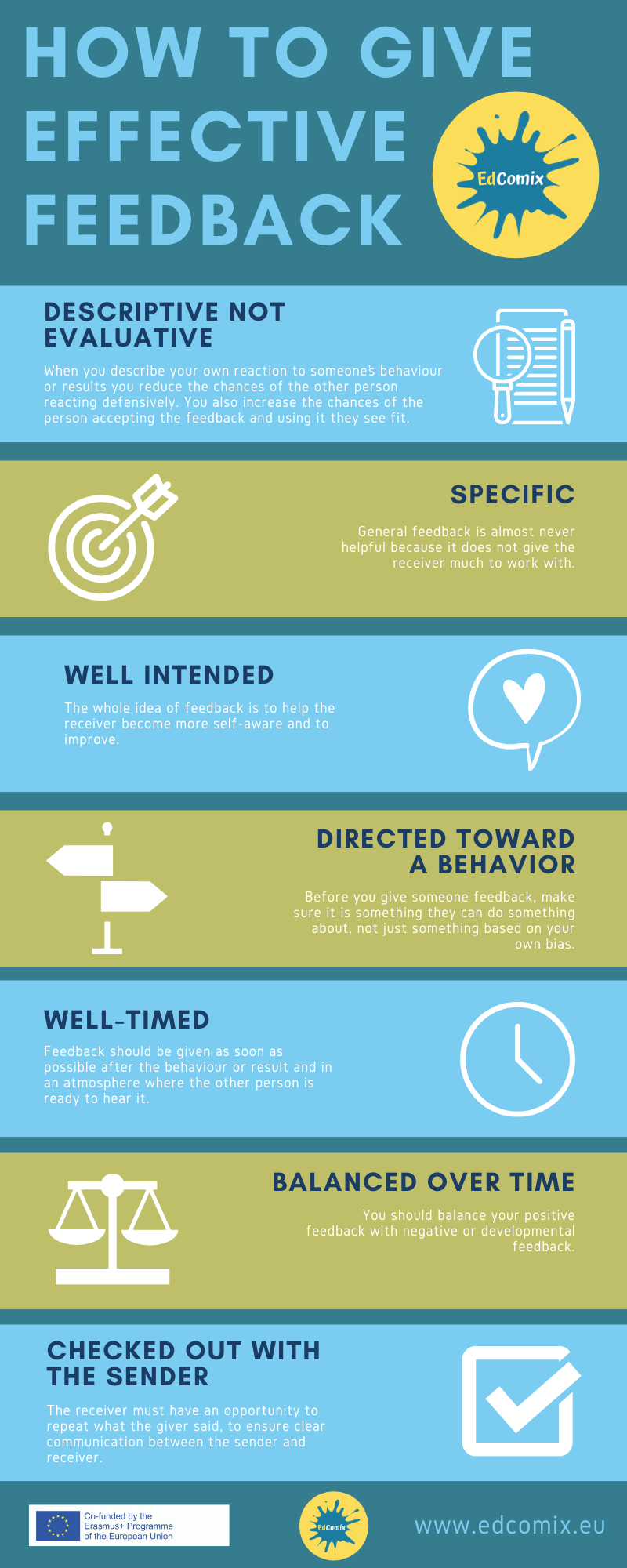
Effective feedback should be:
- Descriptive not evaluate. When you describe your own reaction to someone’s behaviour or results you reduce the chances of the other person reacting defensively. You also increase the chances of the person accepting the feedback and using it they see fit.
- Specific. General feedback is almost never helpful because it does not give the receiver much to work with.
- Well intended. The whole idea of feedback is to help the receiver become more self-aware and improve.
- Directed toward a behaviour the person can do something about and get better results. Before you give someone feedback, make sure it is something they can do something about, not just something based on your own bias.
- Well-timed. Feedback should be given as soon as possible after the behaviour or result and in an atmosphere where the other person is ready to hear it.
- Balanced over time. You should balance your positive feedback with negative or developmental feedback.
- Checked out with the sender. The receiver must have an opportunity to repeat what the giver said, to ensure clear communication between the sender and receiver.
How to explain to your colleagues why you’re using comics in the classroom
In order to get a better understanding of how to explain to your colleagues why you are using comics in your lessons or why you are spending your time creating them we have created three types of teachers that you might encounter.
Teacher 1: New teacher, 0-2 years’ experience, hesitant to try new things
Novel teachers might have limiting beliefs, such as: “I’m not able to draw a comic strip from scratch”, “students won’t take me seriously so I can’t do it”, or “I can’t write my own comic”.
In this case, the most efficient way to encourage this teacher to use comics in their classroom is by showing them how efficient and easy to use comics can be. Let them observe a lesson where the teacher is using comics, get them to participate and to be one of the students. This way they will get a different perspective on the efficiency of comics. Help this teacher with ideas and possible activities, show them step by step how to use comics and most importantly discuss the impact that these might have on their lessons and students’ development.
Teacher 2: Experienced teacher, over 15 years’ experience, well-organised, follows a more traditional methodology.
This type of teacher might believe that comics are not good enough for teaching because students don’t learn anything from them.
In this case, firstly you have to understand their point of view and then you could talk to this teacher about their learning outcomes. Explain that any learning outcome that they might have for their students could be achieved partially or totally through the use of comics. We are not saying that using comics is the only way, but that it can be a fun and innovative way of teaching young learners. To get them to understand your point of view, ask powerful questions such as: “For what reason do you think I use comics?”; “What do you want for your students?”; “How would you use comics?”. Don’t force your point of view on them, but make them understand it and guide them through the process.
Director of Studies/Manager
Your director of studies might have doubts regarding using comics in the classroom and spending your time creating comics instead of doing something else that in their opinion is more productive. They might also think that parents won’t understand this method of teaching and reject it.
In this case, you could explain how meaningful comics can be and how highly effective they can be among students. Parents will slowly understand the value of comics by seeing their children’s results and improvement. Regarding the time spent on creating comics, you could argue that if the comics are created with help from students, they will constantly practise writing, reading, speaking and even listening. So, this makes the time spent making comics valuable and productive.
Concerns that a teacher might have when using comics
Not “real reading”
Students, parents and even teachers retain outdated views about comics being inferior to “real” reading and hence have little educational value. It is believed that “good reading” is equal to “difficult reading” that challenges the ESL/EFL reader which might make comics inferior. We have to remember that comics have important pedagogical consequences for language learners as much as books and extended prose do . Comics are not traditional forms of literature, but they motivate students to read and even help those who struggle with reading in a second language.
Not taken seriously
It is generally believed that comics are supposed to be funny which makes them less meaningful and teachers do not consider them to be serious material for their lessons. We have to keep in mind that not all comic books are light reading, but many comics or graphic novels address serious topics such as war, current events, racism or family relationships. At the same time, if comics are funny, teachers should take this opportunity to introduce language learners to the culture and humour of English-speakers.
Not useful for teaching grammar and vocabulary
There are many concepts that can be taught through comic books, from cultural aspects to skills such as reading, listening, writing and speaking. But if we analyse them even more, we realise that vocabulary plays an important part and by creating our own comic strips we can introduce any topic we want to our students. It gives us the freedom to explore many subjects and we are not limited anymore. In terms of grammar, studies have shown that students are more open to practicing grammar through non-traditional methods. Doing one exercise after another is not as effective as introducing a grammatical item (for example conditionals) in a comic strip created by the teacher, students or even in a pre-existing one.
References
A Model for Giving Feedback SA Best Practices: used with permission from David Surratt FEEDBACK MUST BE. (n.d.). [online] Available at: https://sa.berkeley.edu/sites/default/files/images/Feedback%20Model.pdf
Feedback Models – feedbackforeducators.com (2020). Feedback Models – feedbackforeducators.com. [online] Google.com. Available at: https://sites.google.com/site/bsnfeedbackmode/feedback-models
Giving Feedback -Useful Models “4 Part” Model. (n.d.). [online] Available at: https://www.potentialunearthed.co.uk/wp-content/uploads/2017/09/Feedback-Models.pdf
Lucidchart.com. (2018). Learn These Powerful Performance Feedback Models. [online] Available at: https://www.lucidchart.com/blog/performance-feedback-models
MOOC Dys English. (2019). Resources Archives – MOOC Dys English. [online] Available at: https://www.moocdys.eu/en/category/res/
Moyle, S. (2020). Giving Feedback: 3 Models for Giving Effective Feedback. [online] Ausmed.com. Available at: https://www.ausmed.com/cpd/articles/giving-feedback
Moyle, S. (2020). Giving Feedback: 3 Models for Giving Effective Feedback. [online] Ausmed.com. Available at: https://www.ausmed.com/cpd/articles/giving-feedback
SessionLab. (2018). 3 Ways to Give Effective Feedback Everytime | SessionLab. [online] Available at: https://www.sessionlab.com/blog/effective-feedback-models/
Stachowiak, D. (2013). 3 Differences Between Feedback and Criticism. [online] Coaching for Leaders. Available at: https://coachingforleaders.com/feedback-vs-criticism/